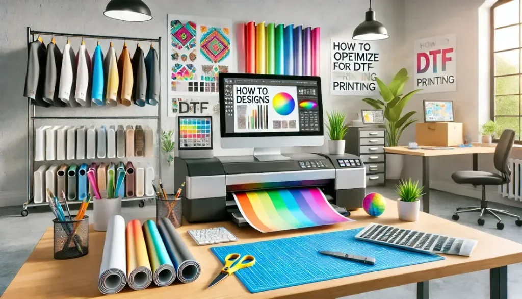
In the world of textile printing, optimizing graphics for DTF printing is paramount for achieving stunning, high-quality results. As this innovative method continues to gain traction, understanding the nuances of graphic design for printing can significantly elevate your work. Utilizing key DTF printing tips such as selecting the right color profiles in printing and employing vector design for printing will ensure vibrant and long-lasting results. Additionally, creating detailed mock-ups for DTF can help you visualize the final product before committing to print, saving time and materials. By integrating these strategies into your workflow, you not only enhance the visual appeal of your designs but also set the stage for client satisfaction and business success.
To fully grasp the intricacies of enhancing visual elements for textile transfers, one must consider the best practices associated with print-ready artwork. The art of improving graphics for Direct-to-Film transfer involves a careful blend of technical proficiency in graphic creation and an understanding of industry standards. By applying effective techniques, such as refining color palettes and utilizing mock-ups for design validation, one can significantly improve outcomes in garment graphics. Emphasizing quality through resolution settings and exploring the unique requirements of fabric choices becomes essential in this context. Mastering these fundamental principles will not only facilitate superior designs but will also contribute to a better overall printing experience.
The Importance of Resolution in DTF Printing
In the realm of DTF printing, resolution is a non-negotiable factor that can make or break the quality of your prints. To achieve stunning results, it is imperative to work with high-resolution images, ideally at a minimum of 300 DPI (dots per inch). This level of detail is essential not only for maintaining sharpness when enlarging graphics but also for capturing intricate details that make a design stand out on various substrates. According to industry experts, low-resolution images risk pixelation and blurriness, which detract from the professionalism and appeal of the final product.
Moreover, high-resolution graphics contribute to a more vibrant color display during the printing process. When images possess adequate resolution, they allow the printer to lay down ink more precisely, ensuring that colors appear true to their original designs. This is particularly important in DTF printing where color profiles play a vital role in achieving the desired result. Therefore, investing time to prepare your graphics at the correct resolution is a fundamental step towards optimizing them for DTF printing.
Mastering Color Profiles for Optimal Results
Color profiles are crucial in the printing industry, especially in DTF printing. During the design stage, utilizing the RGB color profile is advisable, as it aligns well with the capabilities of most DTF printers. However, before sending your design to print, converting your graphics to CMYK ensures that colors translate accurately onto the final printed medium. This conversion is vital; failure to do so can lead to discrepancies in color appearance, resulting in printed materials that do not reflect the intended design.
To achieve the best results, it is recommended to familiarize yourself with color management tools within your design software. Proper calibration of your monitor to reflect accurate colors also plays a significant role in producing prints that meet expectations. By mastering color profiles, you not only enhance the clarity of your designs but also ensure that your artwork remains true to its original vision once printed.
Choosing the Right Design Software for DTF Printing
Selecting the appropriate design software is a fundamental step in the graphic design process for DTF printing. Utilizing vector graphic software such as Adobe Illustrator is highly recommended, as it allows for the creation of scalable designs without loss of quality. Vector files are versatile and maintain crispness whether they are resized for a small label or expanded for a large banner. This flexibility is crucial for designers aiming to produce a variety of printed materials efficiently.
In addition to vector software, it’s essential to explore features that support color management and layer adjustments. The right tools can help streamline your workflow, allowing for adjustments that keep graphics sharp and vibrant. As software options continue to evolve, remaining updated on the capabilities of these tools can significantly enhance your efficiency in producing high-quality graphics for DTF printing.
Effective Layer Management Techniques
Layer management is an often-overlooked aspect of preparing graphics for DTF printing. Proper organization of layers within your design file not only simplifies the editing process but also plays a crucial role in the accuracy of the final print. By keeping layers uncluttered and only including necessary components, you can ensure that the file remains efficient and reduces the risk of errors during the printing process.
Furthermore, utilizing layer features to group similar elements can streamline adjustments, allowing for swift edits and a more cohesive design. By managing layers effectively, you can also minimize potential printing complications, ensuring that each element of your design aligns perfectly during the DTF application process. This level of attention to detail is essential for achieving professional-grade prints that meet the standards of today’s competitive marketplace.
The Art of Mock-Ups in DTF Printing
Creating mock-ups is a vital step in the design process for DTF printing, as it allows designers to visualize how their graphics will appear on different materials. This phase offers the opportunity to test various fabric types and assess how colors and details hold up under different conditions. By conducting these tests, you can identify any necessary adjustments early on, reducing the risk of costly revisions or remakes after your final print.
Additionally, mock-ups serve as a valuable communication tool with clients or stakeholders, providing a tangible preview of the intended design. By showcasing your graphics on realistic fabric representations, you can gather feedback and make informed decisions before moving into full production. This practice not only enhances collaboration but also contributes to the overall success of your DTF printing projects.
Implementing a White Ink Strategy for Dark Fabrics
When working with dark fabrics, incorporating a white ink base layer is a strategic move that enhances the visibility and vibrancy of printed designs. This technique serves to provide a backdrop that allows colors to pop, improving the overall quality of the print. Without a proper white layer, colors can appear muted or washed out on darker materials, leading to disappointing results.
By carefully aligning and optimizing the application of the white ink layer, designers can elevate their prints to new heights. It’s essential to collaborate closely with your DTF printer to understand the specific requirements and adjustments necessary for each job, ensuring that you achieve the best adherence and color vibrancy. This approach not only maximizes the potential of your designs but also reinforces the importance of planning and execution in DTF printing operations.
Frequently Asked Questions
What are the key tips for optimizing graphics for DTF printing?
To optimize graphics for DTF printing, focus on using high-resolution images with at least 300 DPI, apply RGB color profiles in the design stage before converting to CMYK for printing, utilize vector design software like Adobe Illustrator, manage layers effectively, conduct mock-ups on various fabrics, and implement a white ink strategy for dark fabrics.
How does resolution affect graphics for DTF printing?
Resolution is crucial for DTF printing as high-resolution images, ideally 300 DPI or higher, ensure that prints are sharp and detailed. Lower resolutions can lead to pixelation, diminishing the quality of your design and resulting in unsatisfactory prints.
Why is color profile management important in DTF printing?
Color profile management is essential in DTF printing because it ensures color accuracy. Using RGB during design and converting to CMYK before printing aligns your colors with the printer’s capabilities, enhancing the final output’s vibrancy and fidelity.
What role do mock-ups play in optimizing designs for DTF printing?
Mock-ups are integral to optimizing designs for DTF printing as they allow you to visualize how colors and details perform on different fabrics. This testing helps identify any necessary adjustments before final production, leading to a better-quality final product.
How can layer management improve DTF printing graphics?
Efficient layer management is vital in graphic design for DTF printing. Keeping layers organized and only including necessary elements helps streamline the printing process, reducing complications and ensuring that your final print accurately reflects your design intent.
What are effective strategies for designing graphics with white ink in DTF printing?
Using a white ink base layer when printing on darker fabrics enhances color vibrancy and overall print quality. Adjusting the alignment and application of white ink is critical to achieving the best results, as it serves to support and intensify the colors in your design.
| Key Point | Description |
|---|---|
| Maximize Your Designs | Essential for aesthetic appeal and high-quality results in DTF printing. |
| Understanding DTF Printing | DTF printing involves transferring graphics onto fabric using a special film and heat. |
| Resolution and DPI | Use high-resolution images (at least 300 DPI) to avoid pixelation. |
| Color Profiles | Design in RGB and convert to CMYK for accurate color representation during printing. |
| Design Software | Utilize vector graphic software like Adobe Illustrator to maintain quality during scaling. |
| Layer Management | Organize layers efficiently to simplify the printing process and enhance accuracy. |
| Testing and Mock-ups | Conduct tests on various fabrics to visualize color and detail performance before finalizing designs. |
| White Ink Strategy | Use a white ink base layer when printing on dark fabrics to enhance vibrancy and quality. |
| Edit the Background | Ensure backgrounds complement main designs and use transparency to avoid artifacts. |
Summary
Optimizing Graphics for DTF Printing is crucial for achieving high-quality and visually stunning designs. To create effective prints, designers need to focus on key aspects such as using high-resolution images, understanding color profiles, and utilizing the right software tools. Managing layers efficiently and conducting thorough tests on various fabrics also play an essential role in ensuring that the final product reflects the intended designs accurately. Embracing these optimization techniques empowers designers to enhance their graphic projects and stay competitive in the dynamic DTF printing landscape.